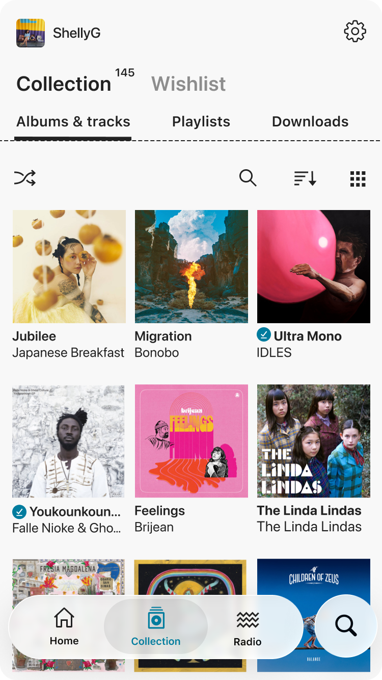
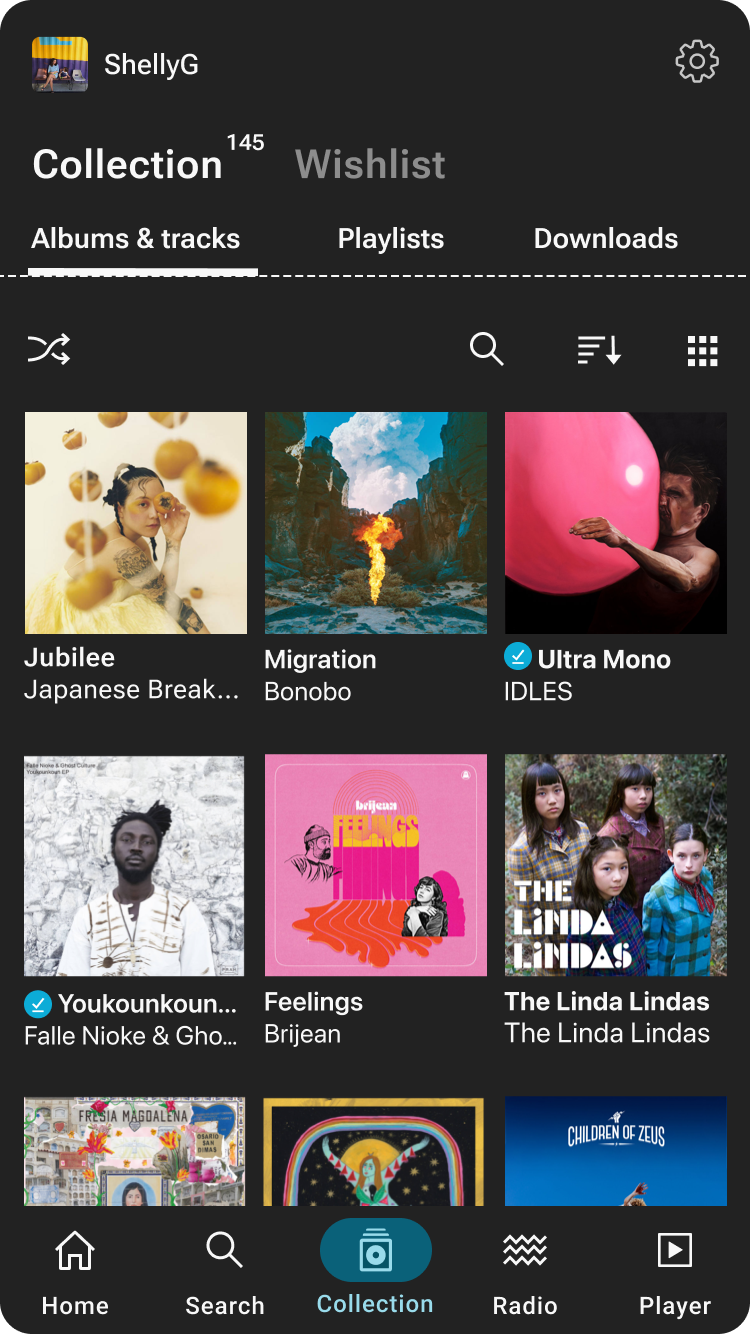
- Long-standing mobile apps with a mix of legacy patterns and interaction models.
- Incremental improvements prioritised over wholesale redesign to protect stability.
- Foundation work integrated into feature delivery within a small, cross-functional team.
Role
Responsible for evolving core patterns, improving accessibility, and reducing design debt across iOS and Android.
Team
Cross-functional partnership between Design, Product and Engineering.
Ongoing
2021-Present
Context & Constraints
Clarity
Decorative elements competed with core content, reducing focus on the music itself.
Accessibility
Contrast and tap-target sizing varied, creating usability and accessibility challenges.
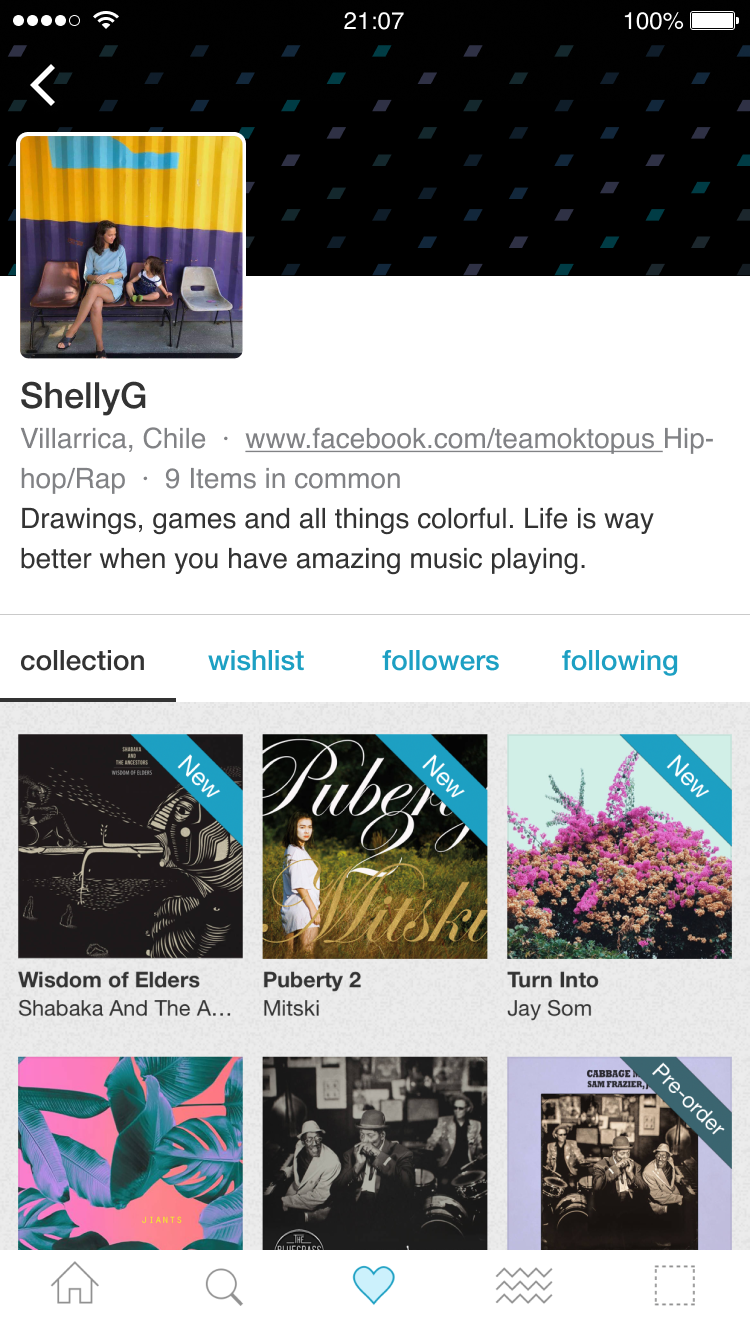
Example of the mobile UI prior to foundation improvements
Hierarchy & spacing
Inconsistent hierarchy made scanning profile information harder than necessary.
Pattern inconsistency
A mix of legacy and newer UI patterns created fragmentation across the screen
Design Principles
1. Accessibility is a core requirement, not a layer.
2. Improve clarity without visual churn.
3. Design for incremental change and future growth.
4. Align with web patterns, while leveraging native behaviour.
Focus Area 1 Core Patterns
Downloads, queueing, and playlists were introduced as new features, designed specifically to add value to music users had purchased. Rather than treating them as isolated additions, each feature was used as an opportunity to establish shared patterns, introduce native components, and strengthen the foundations of the mobile experience.
A. Designing for ownership-first experiences
Core features were designed to clearly reflect ownership and reinforce the value of purchased music with access to more features.
Merch Options
Merch options are presented in a carousel alongside album artwork to encourage browsing purchase options, whilst the user listens to the album.
Before purchase
The unowned state emphasises discovery, browsing and purchasing.
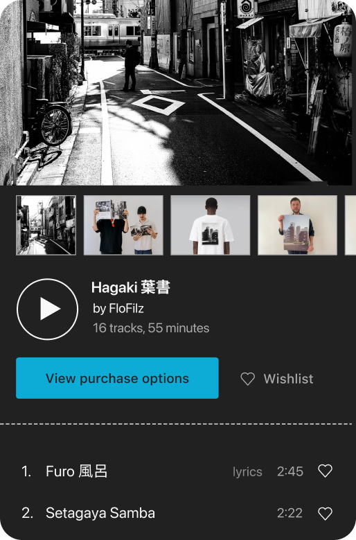
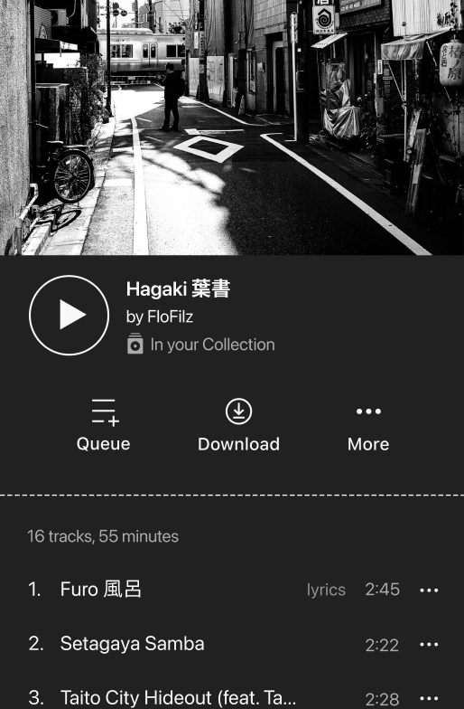
After purchase
The owned state pivots the same screen towards listening, downloading, and curating the collection.
Ownership behaviour
Unlike streaming services, ownership-only actions stay on the surface, making the benefits of purchase immediately visible and accessible.
B. Establishing Shared Native Patterns
Platform-native components became the standard for common interactions, reducing custom UI and improving predictability across the app.
The interaction stays consistent while native components handle platform-specific behaviour.
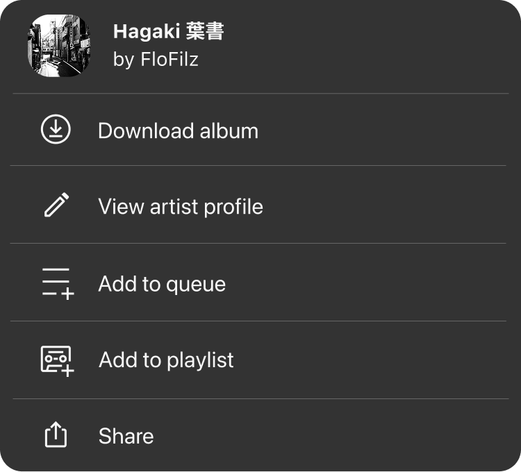
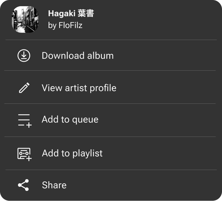
Even within native menus, iconography remains an opportunity to differentiate. Here, a mixtape icon reinforces playlists as handmade and curated.
C. Improving hierarchy in the Collection view
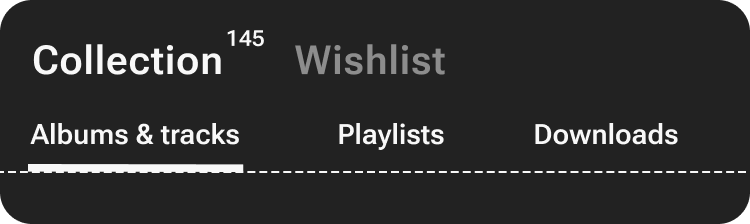
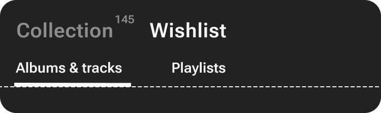
The Collection view hierarchy was refined to better reflect ownership and content type, helping users quickly understand what they owned versus what they had wishlisted.
Focus Area 2 Dark Mode
Dark mode wasn’t treated as a visual refresh, but as a systems problem. Introducing shared colour tokens and paired light and dark theme values to ensure colour, contrast, and state handling worked consistently across a wide range of legacy screens and interaction patterns.
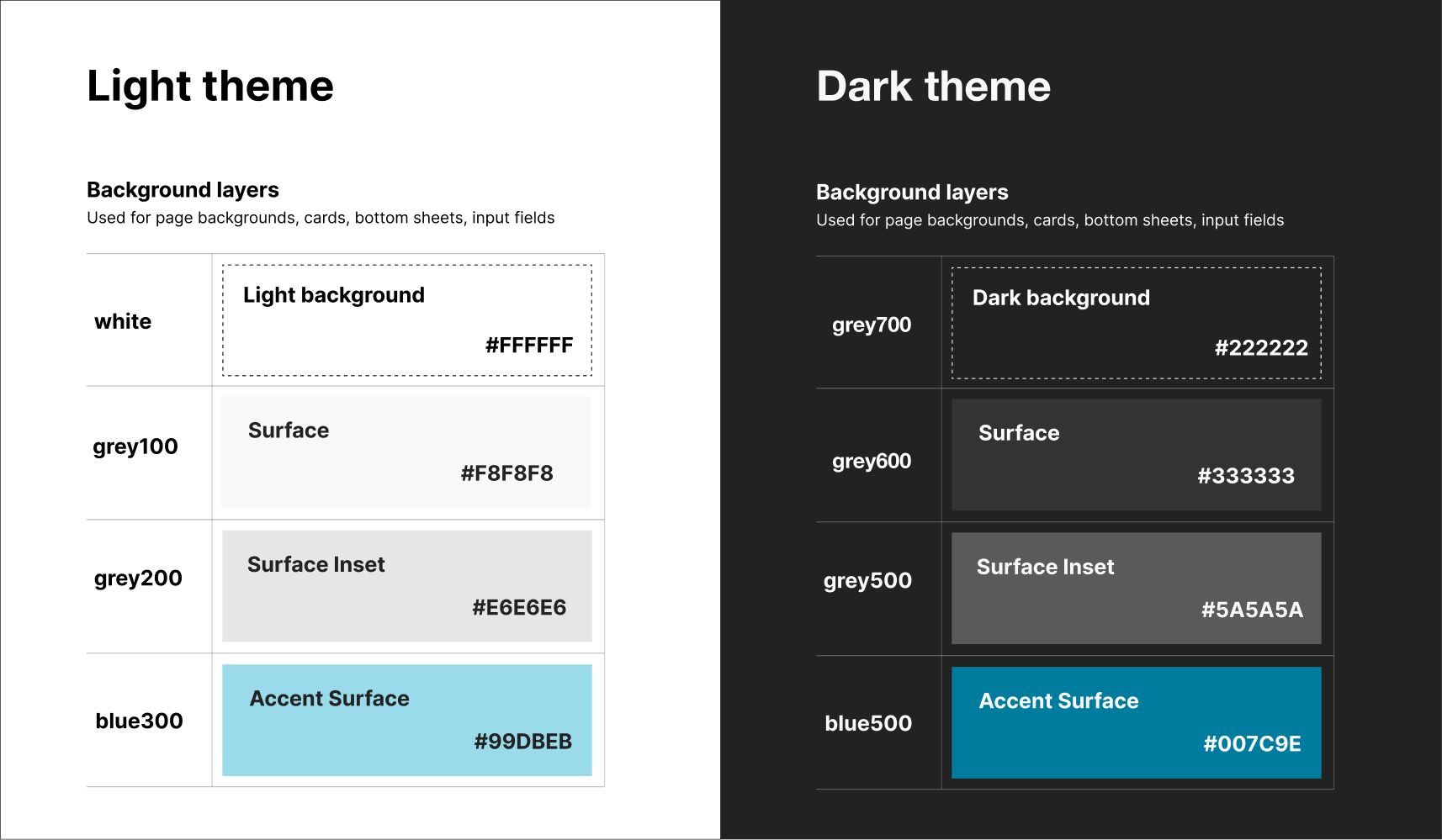
The legacy screen landscape required a full component audit before a single token was finalised, stress-testing every pairing against the oldest surfaces in the product.
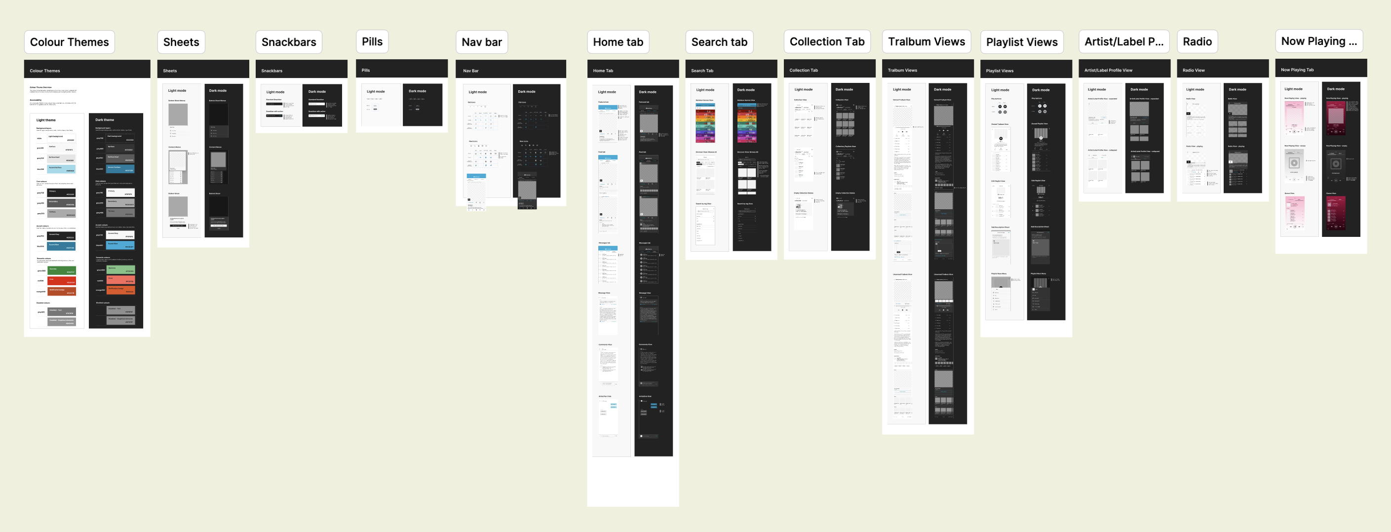
The audit also became a forcing function for UI debt that had quietly accumulated: decorative noise, redundant dividers, and over-specified states, all cleaned up without needing a dedicated refresh sprint.


Consistent state handling
Legacy card component adapted for dark mode
Improved colour contrast and reduction of visual clutter and decorative elements
Focus Area 3 Accessibility & Assistive Technology
A. Screen reader UX specs and testing guides
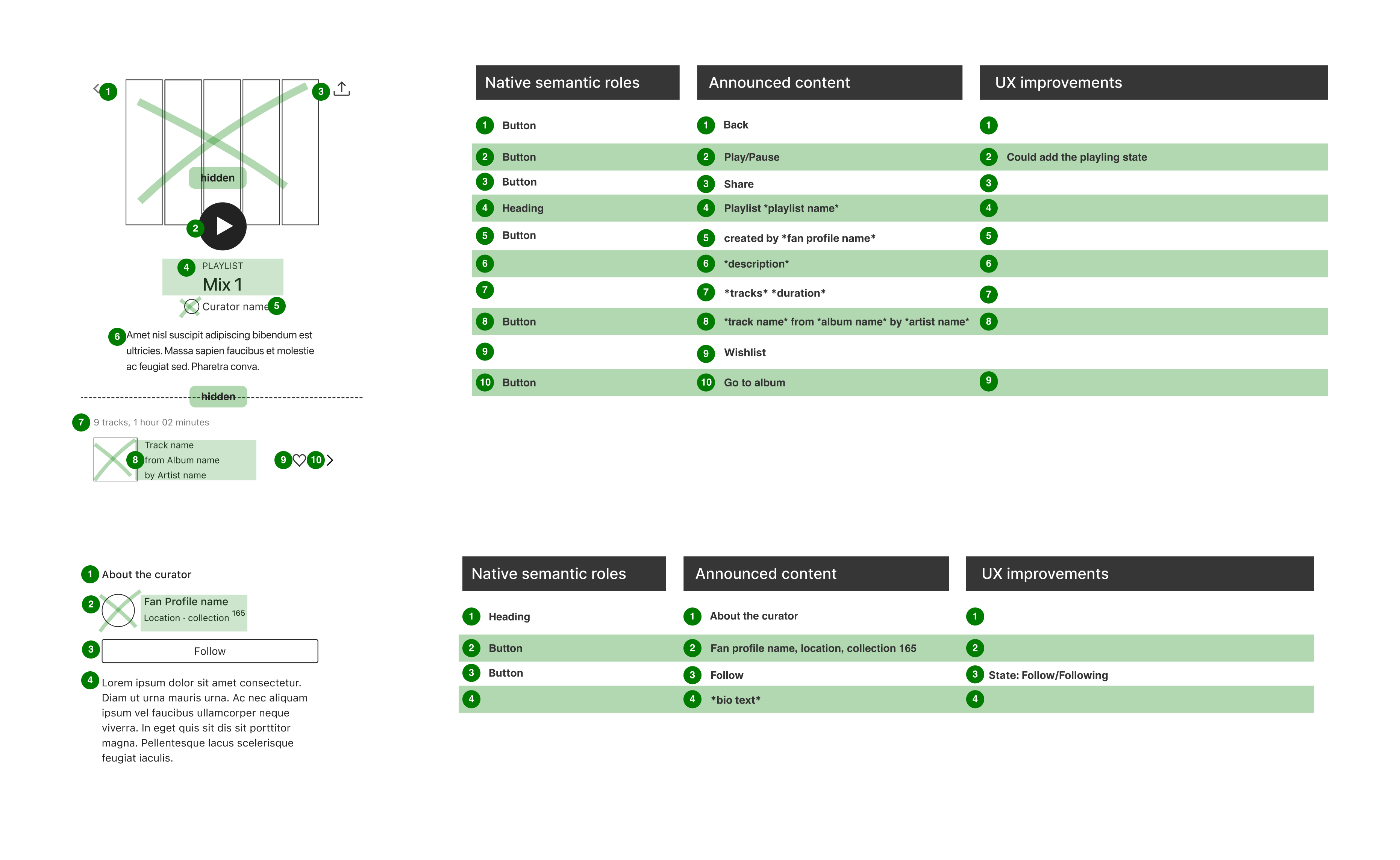
Accessibility was built into the work from design through to delivery, rather than added as a layer at the end. Alongside the design spec, I created screen reader UX specs as part of handoff to define how core flows should behave with VoiceOver and TalkBack. Closer to release, I also put together an assistive technology testing guide for internal QA, giving teammates with less accessibility experience a practical way to set up screen readers on their own devices, follow test steps, and contribute to accessibility testing across the wider team.
View the Screenreader UX Template and
View the Assistive Tech Testing Guide
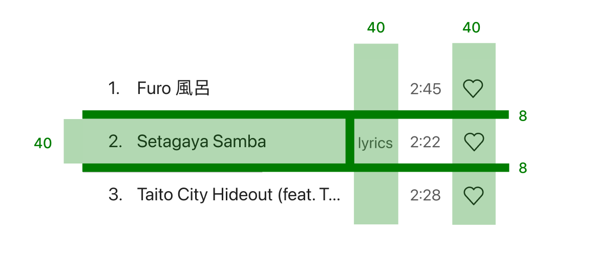
B. Improving touch targets and interaction clarity
Tap areas were reviewed across compact list, playback, and menu interfaces to improve reachability and reduce accidental taps. This work often involved subtle layout adjustments rather than visible redesign, helping frequently used actions feel more reliable without adding visual weight.
C. Hierarchy, labels and announcements
Small changes to hierarchy and labelling improved how information was announced by screen readers, helping ownership context surface before secondary content filters. Separating primary and secondary navigation also made Collection and Wishlist states easier to understand both visually and through assistive technology.
Primary mode announced first
Ownership context is established before content filters are introduced.
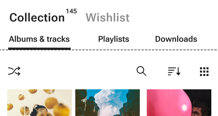
Secondary filters grouped below
Albums, playlists, and downloads follow as a second level of navigation.
What's Next
This work continues as the mobile apps evolve. New features are treated as opportunities to strengthen shared patterns, expand accessibility coverage, and gradually replace legacy behaviours with clearer, more resilient foundations.